
Contents
On July 5, 2024, Google will fully transition to mobile-first indexing. This is a major change that could significantly impact the rankings of millions of businesses—from large corporations to brick-and-mortar mom-and-pop shops. More than half of global web traffic now comes from mobile devices, and that means your site could lose traffic overnight if it isn’t in tip-top shape.
In this post, we’ll go over what mobile-first indexing is, how to check your site’s mobile performance, and how this change will affect your local rankings.
Need help optimizing your site for this major change? We’re currently offering 50% off our mobile optimization service. Reserve Your Deal Now.
What is “Mobile-First Indexing”?
Let’s start with the basics—and I promise we won’t get too technical here. Mobile-first indexing is actually simple: it means Google will specifically use the mobile version of your website to determine how well your site performs and to decide how high it should rank in search results. In the past, Google used the desktop version of websites to make these decisions. This new shift aligns with the growing trend of people primarily using their smartphones to browse the internet.
If you’re a local business owner, this is a pretty big deal. A lot of small business websites have either not been optimized for mobile or, frankly, not been updated in years (or even decades). So ensuring your website is mobile-friendly is more important than ever.
Why Mobile-First Indexing Matters
About 61% of global web traffic comes from mobile devices—and that number increases every year. That means 3 in 5 users are visiting your website from their phones. For local businesses, this means more and more potential customers are likely to discover you via their mobile devices. Imagine you run a local bakery (and maybe you do): a potential customer might search for “best cupcakes near me” on their phone. If your site isn’t optimized for mobile, they might not find you at all after Google’s update.
To be fair, Google’s aim is to provide its users with the best experience possible. (Whether they actually succeed at that is up for debate.) That should say a lot about how important mobile-optimized websites have become. By prioritizing mobile-friendly sites, Google can ensure users find content that loads quickly and displays well on smaller screens, especially since people are always on the go or have limited time. Or, let’s be honest, they’re scrolling on the toilet. Whatever people are up to, this change makes mobile optimization essential for maintaining or improving your Google ranking.
Impact on Your Website
Mobile Usability
So, what does this shift mean for you? First and foremost, your site must be easy to navigate on a mobile device. If visitors have to zoom in to read text or struggle to click tiny buttons, they’re likely to leave your site quickly. This high “bounce rate” can negatively affect your search rankings. Think of it this way: if a customer walked into your physical store and couldn’t find what they were looking for or had trouble moving around, they’d probably leave. The same goes for your mobile website.
And Google knows when users are frustrated with your site, too. It’s kind of like a digital Greek god. It knows everything, and if you displease it, it will smite you—but please it and the Google God shall shower you with rewards. Narcissistic, isn’t it?
Speed and Performance
Another critical factor in ranking is page speed. Mobile users expect fast loading times, and a delay of just a few seconds can lead to a significant drop in engagement.
Seriously, people’s attention spans are getting shorter every year. Just a few years ago, it used to be that a user would bounce after 4 measly seconds—now they expect sites to load in under 3 seconds. You read that right: if your site doesn’t load within three seconds, people will literally leave. It’s crazy, but I have to admit, I’ve done it too. (Guilty as charged!)
53% of visits are abandoned if a mobile site takes longer than 3 seconds to load.
Google Data, Global, n=3,700 aggregated, anonymized Google Analytics data from a sample of mWeb sites opted into sharing benchmark data, March 2016.
Needless to say, ensuring your site loads lightning fast on mobile devices can boost user satisfaction and, in turn, your search rankings. But the challenge lies in actually delivering. Mobile sites are notoriously difficult to optimize for speed, especially considering Google tests your site over a simulated “slow 4G” connection. Yikes.
Key Areas to Focus On
Responsive Design
This is one easy way to ensure your site functions well on mobile (although, it isn’t technically the best way for a site to be optimized for smart phones, but we’ll save that discussion for the nerds). In short, responsive design ensures your website adapts to all screen sizes. Whether a visitor is using a phone, tablet, laptop, or some kind of odd in-between size like split-screening or your mother’s old Kindle (if it ain’t broke, don’t fix it!), your site will offer a seamless experience if it’s responsive.
Mobile-Friendly Content
Content should be easy to read on small screens. Use large fonts, high contrast color schemes, clear headings, and ample white space. Ensure your navigation is straightforward and your buttons are large enough to tap easily. (Google likes to whine about elements that are too small to tap.)
Plus, incorporating visuals and interactive elements can greatly enhance your user experience. For example, consider using:
- Infographics: Summarize your information visually. (Do as I say, not as I do.)
- Interactive Maps: Show off your locations or service areas in an easy-to-use map.
- Videos: Provide about us videos, tutorials, or explainers, which are easier to consume on mobile devices.
Don’t wait until it’s too late. Take advantage of our limited 50% off website optimization deal to ensure your site is fully optimized for mobile and keeps your visitors happy.
Technical Aspects
We know: this stuff is probably easier for the pros to handle. But it’s still worth mentioning for the sake of thoroughness. (That’s a word, I checked.) Key technical elements include things like structured data, which helps search engines understand the content on your site, and image optimization, which reduces load times further. Also, keep your mobile and desktop content consistent to avoid any confusion for customers who check you out on multiple devices.
If people have a negative experience on mobile, they’re 62% less likely to purchase from you in the future.
Source: Google/Purchased, U.S., “How Brand Experiences Inspire Consumer Action,” n=2010 U.S. smartphone owners 18+, brand experiences=17,726, April 2017.
Tools and Resources
Here’s where you actually get to figure out how well your site is performing across different devices and with real users.
PageSpeed Insights
This tool is your best friend. Actually, no, that’s a lie—it’s your worst enemy. But it is a super handy tool from Google. PageSpeed Insights analyzes your site’s performance and provides actionable (although mostly technical) tips to improve your speed. Just enter your website’s address and let it do its thing.
How to use PageSpeed Insights:
- Enter URL: Go to PageSpeed Insights and enter your website’s URL.
- Analyze: Click “Analyze” and wait for the results.
- Review Mobile: Check the score and see detailed suggestions for improvements.
- Review Desktop: Click on the desktop icon to find out how fast your site runs on desktop.
- Implement: Follow the actionable tips provided to enhance your site speed.
Here’s an example of our own website’s performance on mobile:
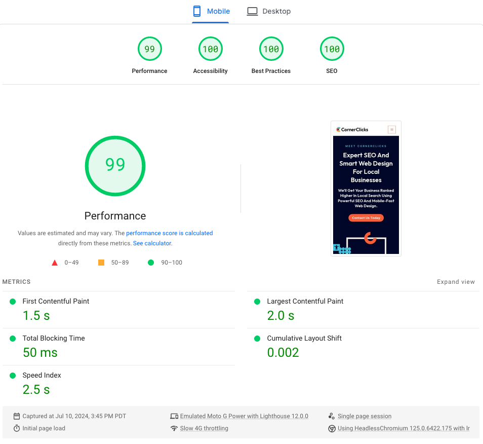
Google PageSpeed Insights showing a performance score of 98 for CornerClicks on mobile on July 1, 2024
CornerClicks consistently scores between 96-98 on mobile (out of 100; it’s just like school, and we’re the annoying overachievers!). It’s typical for your score to fluctuate slightly (a few points here and there), however, it can also fluctuate much more for reasons out of your control. For instance, your hosting provider might be slow during maintenance on a Friday night, so you might see a hiccup in performance. That’s why it’s good to check a few times, even over a few days, to get a clear picture of your overall performance.
And hey, you can even stick your competitors’ websites in there too! It might make you feel pretty good—or like it’s time to up your game.
The main point here is that you want your website’s mobile speed to consistently be over 90. And believe us, that’s hard to do, especially with so many moving pieces. It’s not just the design of your site that affects speed; it’s also things like the way it’s coded, your hosting provider, the type of servers you’re paying for, how your site’s images are stored, etc.
But it’s not impossible to get your site super fast.
Enough About Google. What About My Customers?
I promise, this isn’t all about the almighty search engines. After all, real human beings are the ones using your site, right? Well, I’m here to tell you that fast site speeds actually increase conversion rates, too. A lot.
A one second delay in mobile load times can impact mobile conversions by up to 20%.
Source: Google/SOASTA, “The State of Online Retail Performance,” April 2017.
According to various studies, there is a clear correlation between page load times and user behavior, particularly conversion rates. For instance, a study by Cloudflare highlights that for every one-second improvement in page load time, Walmart saw a 2% increase in conversions.
Research from Portent indicates that decreasing page load time from two seconds to one second can boost conversion rates by 2-3 times.
And Think with Google found that decreasing mobile site load times by just one-tenth of a second can lead to an 8.4% increase in conversion rates for retail sites and a 10.1% increase for travel sites. Forget a day; what a difference a second makes.
Other Helpful Resources
There are plenty more tools you can look into, like Ahrefs, Moz, and SEMrush for more in-depth insights and optimization suggestions. They offer features to help you understand how well your site is optimized for mobile and can identify areas for improvement. Plus, they have lots of great resources for SEO, even on their free plans.
Overwhelmed by all these tools? Let us handle it for you. Schedule a consultation and we’ll take care of everything.
Common Web Design Mistakes to Avoid
Poor Contrast Ratios
People care much more about readability than anything else. There’s a reason news sites are all black text on white backgrounds. Your color choices may be lovely, but frustrating. And they may even pose a problem for people with difficulty seeing.
Animations and Fancy Effects
Honestly, no one cares about animations (Reference: Me. I said so. Take my word for it.) Somewhere around ten years ago, everyone started making flashy websites, and at the time, they did look pretty cool. But like all trends, their time has come and gone. And on mobile, animations can be extremely irritating.
It may not be sexy, but a clean, well-functioning site is going to be better than flash any day of the week. And here’s a secret: animated sites tend to break—FAST. We’ve seen brand new sites with animations glitch out in as little as a month. There’s not much point to having a website that doesn’t function.
Pop-Ups and Other Junk
Keep pop-ups to a minimum, and even better if your opt-ins pop in from the bottom rather than blocking the whole page. Either way, I think we’ve all been to websites that feel like a windshield covered in mud. This tends to be a bigger problem with ad-heavy blogs, but still, avoid it wherever possible. Even things like cookie pop-ups shouldn’t be frustrating to navigate around. (Yes, fine, accept cookies, I don’t care anymore!)
Neglecting Consistency
Ensure your mobile site mirrors your desktop site in terms of content and functionality. Consistency will help maintain your potential customer’s trust and help increase engagement. Some industries (such as B2B) also have higher desktop users than others, so consistency across devices is key.
Impact on Local Businesses
Local Search Behavior
For local businesses, appearing in Google’s local rankings is crucial for driving foot traffic and attracting local customers. Consider how often you’ve used your phone to find a restaurant, a nearby store, or a local service. Probably a whole lot more than your laptop, I’d wager.
If I haven’t already stated it enough already, Google’s mobile-first indexing means that if your site isn’t mobile-friendly, your local search rankings are likely to suffer, potentially leading to fewer local customers discovering your business.
On the flip side, a well-optimized mobile site helps ensure your business continues to show up in local searches and provides an enjoyable user experience. This can lead to higher engagement, more foot traffic, and increased sales. (Yay!) Needless to say, local businesses must prioritize mobile optimization to remain competitive and accessible to their community.
Competitive Advantage
Let’s be honest: small businesses tend not to be ahead of the curve when it comes to the latest web standards. And why would you? You don’t need to worry about the major technological headaches that big tech firms do. You’re not competing for millions of users a month here.
However, staying ahead of the tech curve with a mobile-first approach will set you apart from competitors who haven’t yet adapted. And believe me, most of your competitors have not adapted. (We even know of small businesses that don’t have any online presence at all. Seriously.) So a well-optimized mobile site can boost your visibility and put you way ahead of all the other mom-and-pops.
Wrap it Up
Google’s shift to mobile-first indexing is a significant change for everyone, but it’s also a valuable opportunity for small business owners. By focusing on mobile-first optimization, you can make it easier for customers to find you, engage with your site, and purchase your services and products—all of which will get you ranking higher in local search. Plus, your mobile-slow competitors will be left behind, eating your dust.
On the other hand, we also understand that it’s a ton of work, and a lot of this takes technical expertise. So if you need assistance navigating these changes, CornerClicks is here to help.
Whether you need a whole new website or just a bit of tuning up, contact us today, and get ready to start climbing the ranks in local search.
And for a limited time, get your website optimized for this major Google change for a whopping 50% off—Reserve your deal now.